edifice.IconButton
-
class
edifice.IconButton(name, size=10, collection='font-awesome', sub_collection='solid', color=(0, 0, 0, 255), rotation=0, **kwargs)[source]¶ Bases:
edifice.base_components.ButtonDisplay an Icon Button.
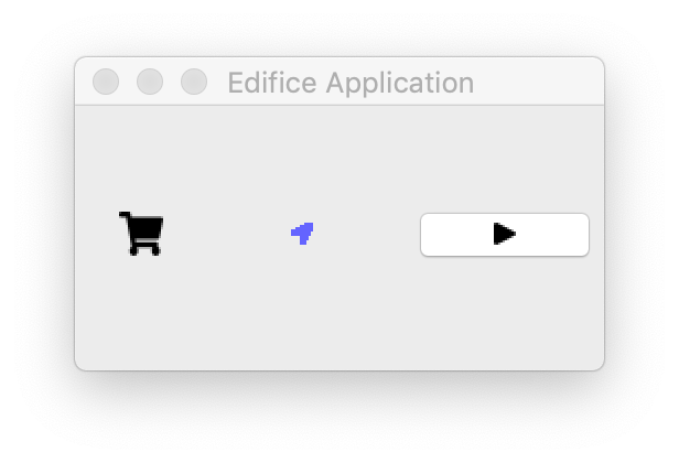
Icon button on the very right.
Icons are fairly central to modern-looking UI design; this component allows you to put an icon in a button. Edifice comes with the Font Awesome (https://fontawesome.com) regular and solid icon sets, to save you time from looking up your own icon set. You can specify an icon simplify using its name (and optionally the sub_collection).
Example:
IconButton(name="share", on_click: self.share)
will create a button with a share icon.
You can browse and search for icons here: https://fontawesome.com/icons?d=gallery&s=regular,solid
- Parameters
name – name of the icon. Search for the name on https://fontawesome.com/icons?d=gallery&s=regular,solid
size – size of the icon.
collection – the icon package. Currently only font-awesome is supported.
sub_collection – for font awesome, either solid or regular
color – the RGBA value for the icon color
rotation – an angle (in degrees) for the icon rotation
Methods
Attributes
childrenThe children of this component.
propsThe props of this component.